




Concept / Serif typography
Serif typography
A typographic characteristic using a type classification with serifs at stroke ends
A typographic characteristic using a type classification with serifs at stroke ends.

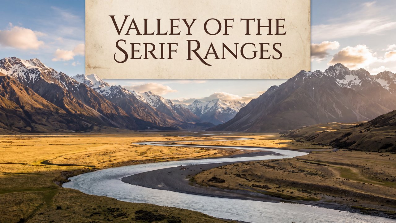
Valley with a river and mountain ranges
Both languages share the English example images. Japanese prompts are the recorded translations.
A phrase to start with
Directs text in the image toward serif typography.
Appearance and effects
Letterforms with serifs at stroke ends appear.
Visual traits
- serifed stroke ends
- letterforms
Expected changes
- Letterforms with serifs at stroke ends are more likely to appear
Five examples
1 — Medium-sized dog
Open image ↗2 — Cat
Open image ↗3 — Teenage boy
Open image ↗4 — Unoccupied interior
Open image ↗5 — Valley with a river and mountain ranges
Open image ↗Meaning and scope
Definition
Serif typography is a typographic characteristic using a type classification with serifs at stroke ends. It does not determine a particular typeface, tradition, formality, legibility, language, or medium.
In more detail
It concerns a type classification with serifs. It is distinct from sans-serif typography and from an impression of tradition or formality.
Includes
- Typography using a type classification with serifs at stroke ends
Excludes
- A particular typeface, tradition, formality, legibility, language, or medium
What this does not imply
- A particular typeface, tradition, formality, legibility, language, or medium
Variability
Text amount, size, weight, placement, and medium can be adjusted separately.
Usage and adjustments
Usage
- Use it for letterforms with serifs
Distinguish similar expressions
- Specify typeface, language, medium, and legibility separately
Typical uses
- Set text in an image with serif typography
Possible failure modes
- It becomes fixed as a particular typeface or formal impression
Content updated:
From the same theme
Items linked through explicit membership in the same theme.

Valley with a river and mountain ranges
Concept
Idea relationship diagram
An explanatory diagram showing elements and relationships through lines and placement.
Compare ↗
Valley with a river and mountain ranges
Concept
Comic panel
A framed area that separates one unit of content.
Compare ↗