
Medium-sized dog
Concept
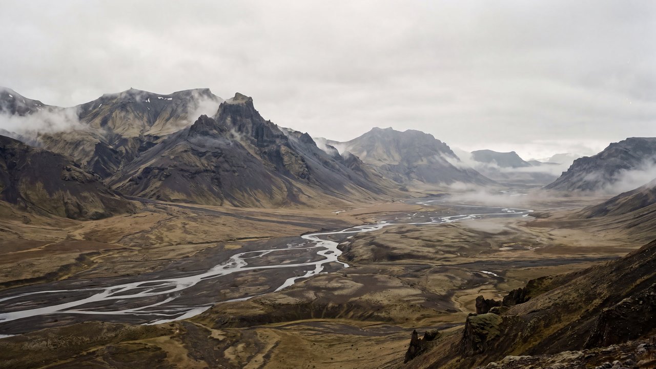
Aerial perspective
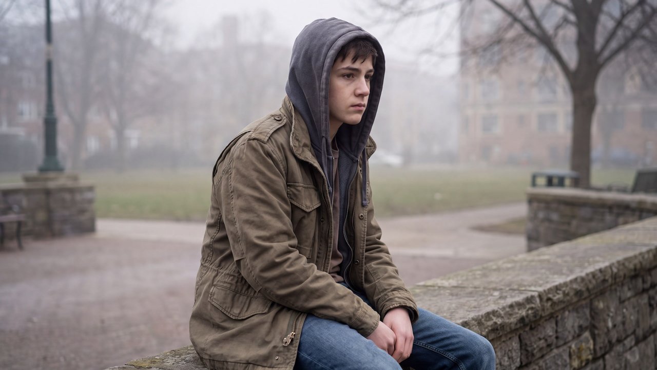
A depth treatment that makes distant forms paler, cooler, and less distinct.
Compare ↗Concept / Muted palette
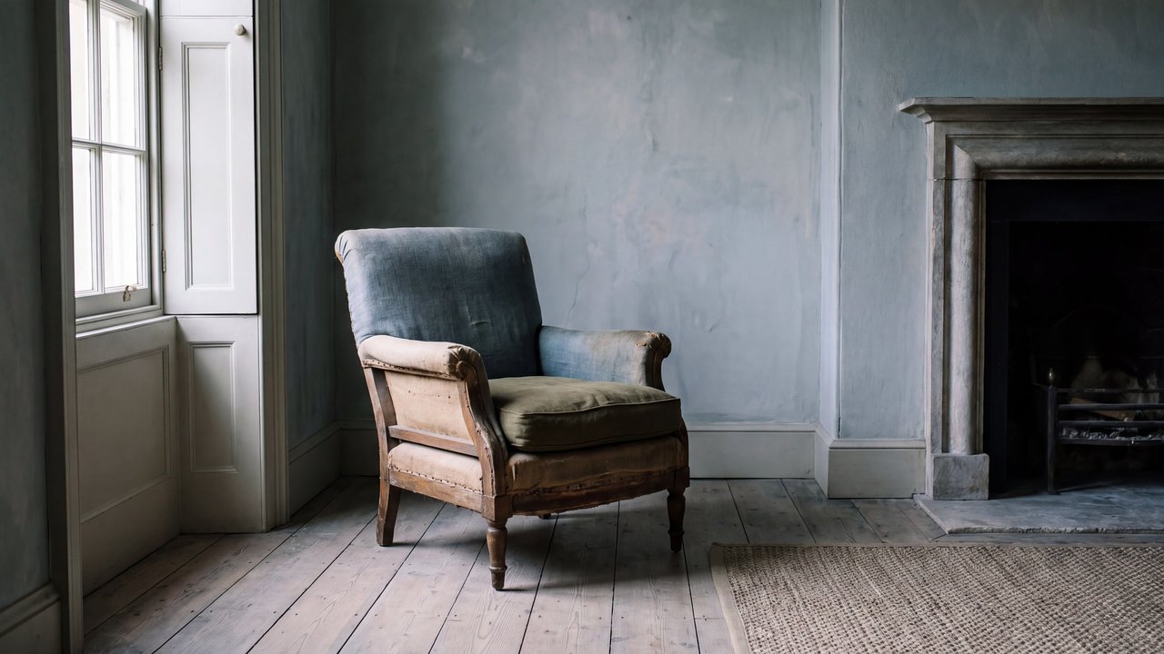
A palette of restrained low-saturation color ranges
A palette of restrained low-saturation color ranges.

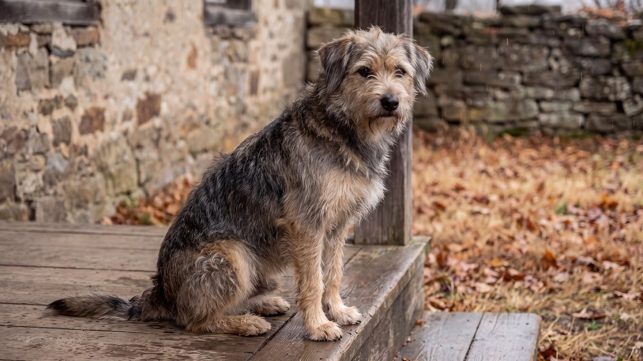
Medium-sized dog
Both languages share the English example images. Japanese prompts are the recorded translations.
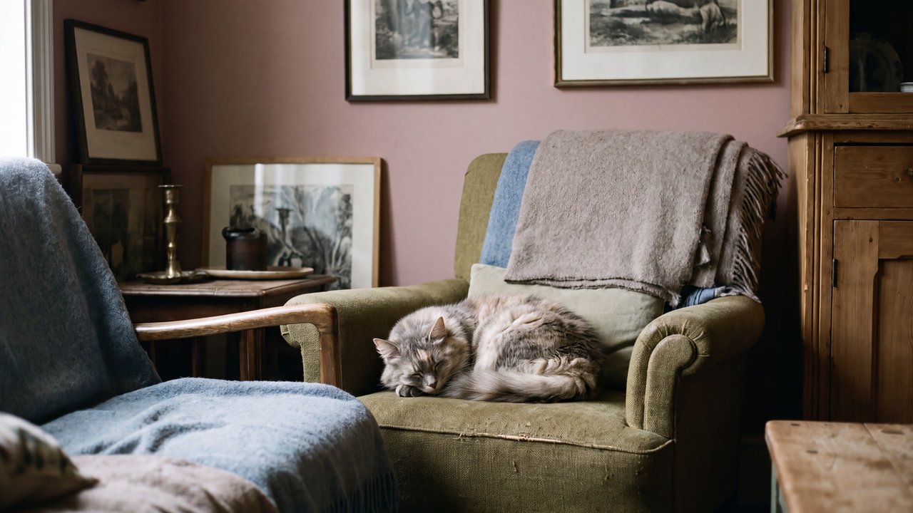
Restrains saturation to create calm color unity rather than vivid intensity.
Restrained colors sit together and create calm color unity.
A muted palette uses restrained colors and avoids intense chroma. It does not include grayscale only, dark values, or a particular era or emotion.
Hues may be warm or cool, with subdued colors that seem mixed with gray linking the image. Value and color count can vary. It is distinct from neon and highly saturated palettes.
Value and hue can be adjusted separately.
Content updated:
Items linked through explicit membership in the same theme.
Medium-sized dog
Concept
A depth treatment that makes distant forms paler, cooler, and less distinct.
Compare ↗
Medium-sized dog
Concept
A composition that balances off-center elements through visual weight.
Compare ↗
Medium-sized dog
Concept
A composition that places the main subject on the image's central axis for focus and stability.
Compare ↗