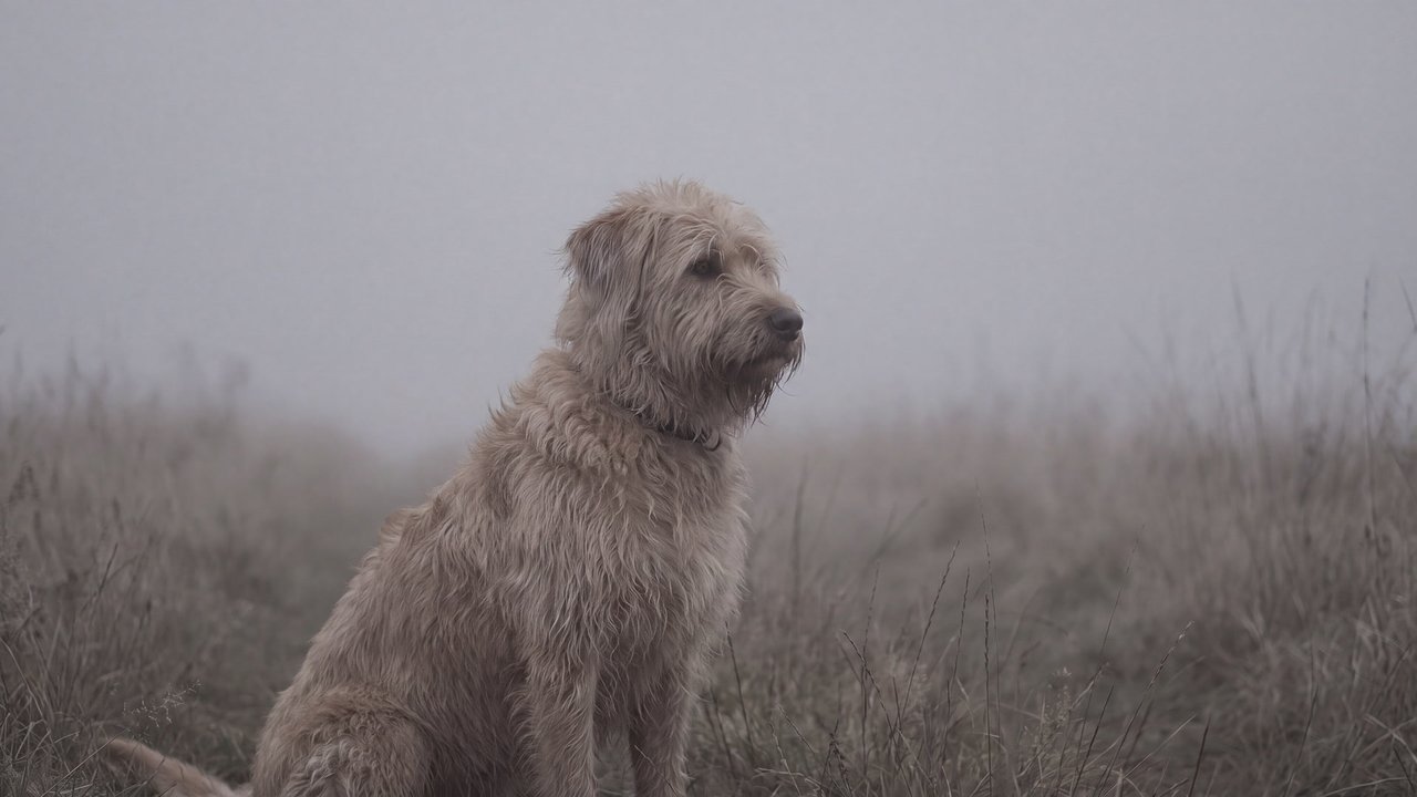




Medium-sized dog
Concept
Aerial perspective
A depth treatment that makes distant forms paler, cooler, and less distinct.
Compare ↗Concept / Low contrast
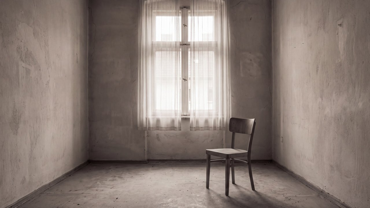
A value design that keeps separation between light and dark small
A value design that keeps separation between light and dark small.

Medium-sized dog
Both languages share the English example images. Japanese prompts are the recorded translations.
Restrains separation between light and dark values to create smooth tonal transitions.
Light and dark areas remain close in value, making boundaries appear soft.
Low contrast restrains value separation between light and dark areas so form boundaries appear gentle. It does not include hue, light source, or exposure setting.
Midtones connect the image and avoid abrupt black-white opposition. It can apply to light or dark images and is separate from high-key and low-key treatment.
Overall brightness can be adjusted separately.
Content updated:
Items linked through explicit membership in the same theme.
Medium-sized dog
Concept
A depth treatment that makes distant forms paler, cooler, and less distinct.
Compare ↗
Medium-sized dog
Concept
A composition that balances off-center elements through visual weight.
Compare ↗
Medium-sized dog
Concept
A composition that places the main subject on the image's central axis for focus and stability.
Compare ↗