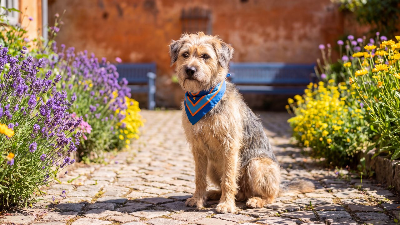
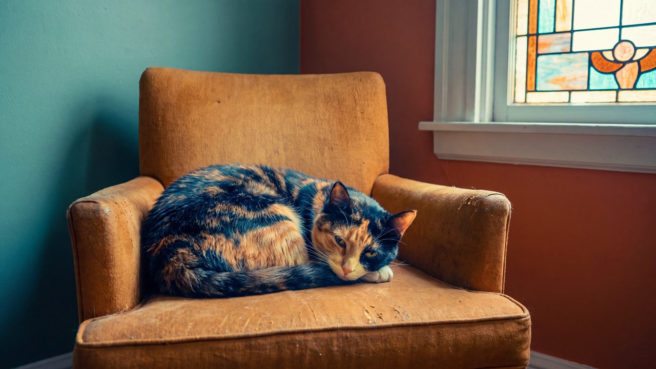

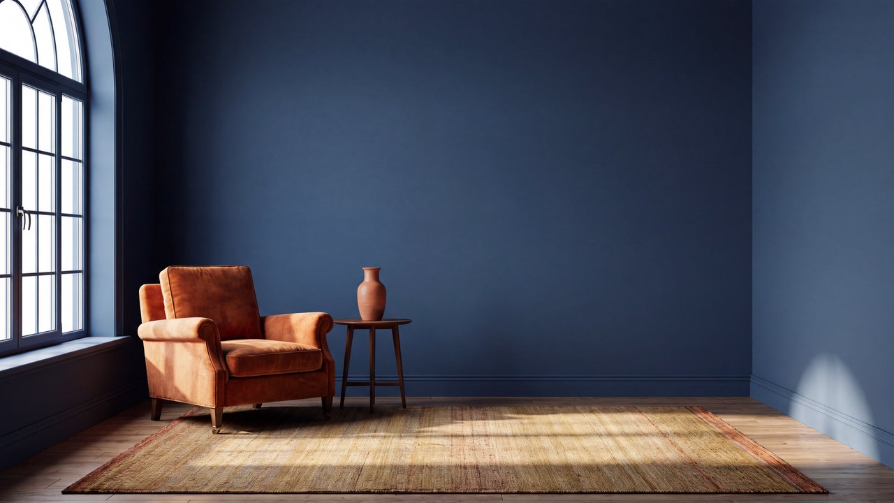


Medium-sized dog
Concept
Aerial perspective
A depth treatment that makes distant forms paler, cooler, and less distinct.
Compare ↗Concept / Complementary colors
A palette that contrasts hues opposite on the color wheel
A palette that sets hues opposite on the color wheel against each other.

Medium-sized dog
Both languages share the English example images. Japanese prompts are the recorded translations.
Sets opposite hues in contrast so their difference stands out.
Two distant hues intensify each other, making color opposition clear.
Complementary colors place two hues opposite each other on the color wheel to make their difference conspicuous. They are distinct from value-only separation and unity among nearby hues.
Combinations such as blue and orange or red and green can make color opposition a focal point. One hue may serve as a small accent; equal area is not required. The palette does not determine emotion, medium, or lighting cause.
Area ratio and saturation can be adjusted separately.
Content updated:
Items linked through explicit membership in the same theme.
Medium-sized dog
Concept
A depth treatment that makes distant forms paler, cooler, and less distinct.
Compare ↗
Medium-sized dog
Concept
A composition that balances off-center elements through visual weight.
Compare ↗
Medium-sized dog
Concept
A composition that places the main subject on the image's central axis for focus and stability.
Compare ↗